font and title choices
We knew we wanted to use a simple font for our titles in our opening title sequence because it is more effective for it to be simple. Using specialised 'horror' fonts is child-like and humorous, as it does not look professional enough. This is why we chose to cut to a blackout shot in between specific shots, so that we could add white text for our titles. We were aware that going to a blackout may detract the audience's attention away from our title sequence and may take them back into reality. This why we decided to create a rhyme sung by our main character to repeat through the sequence so that it was able to flow and keep the audience stuck in this title sequence.
However, for the title that shows the name of our horror we wanted to make it slightly different so that it stood out and the audience would remember the name. Therefore, we, once again, cut to a blackout but this time used a red font, to relate it to the blood aspect in horror. For the title 'crazed' we decided to use a font that we found on www.dafont.com. It is a striking bold font appearing in capitals which is the first thing the audience see. There is also another font underneath that is messy and uncontrollable, which was useful for us to use because it was able to reflect the underlying personality of the character 'Cassie' in our horror. The different fonts reflect the idea that our main character has this normal, ordinary personality which is clear for everyone to see, however, she also has this more secretive, chaotic side of her that is shaded by her normality to fool people. We thought this added more hidden substance to our horror, and therefore, making it more effective.
A.R
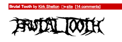
This is a font from www.dafont.com. This was under the 'horror' cagetory, however, we did not think it was professional enough to be used in our opening title sequence. It looks too childish and "in your face" to be used in a successful opening title sequence.

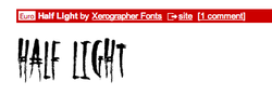
This font was related to the sub genre of zombies, as it had a hand reaching out in one of the letters. This was effective, however, would not have been appropriate for our opening title sequence.
This font looks effective and professional, therefore, we considered using it. However, the font below is the final font we hose to use as we thought it was unique because it reflected the storyline of our opening title sequence.
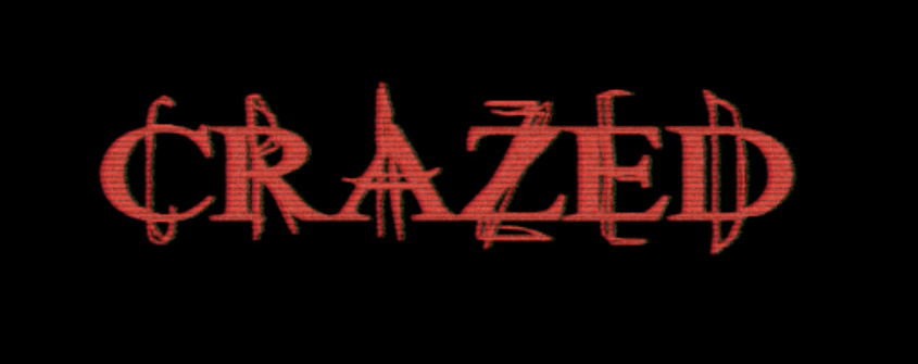
This is the font we decided to use for our opening title sequence. We thought it was clever and unique, as it represented the double personality of our killer. We wanted to use the colour red because it reflects the conventional representation of blood being associated with horror films.
The second layer of our font has the effect of looking like it has been scratched on, which reflects the weapon of our killer, as she uses scissors. This is effective as it shows the double personality of her craziness, which is shown when she scrapes the wall with her weapon towards the end of our opening title sequence.
The second layer of our font has the effect of looking like it has been scratched on, which reflects the weapon of our killer, as she uses scissors. This is effective as it shows the double personality of her craziness, which is shown when she scrapes the wall with her weapon towards the end of our opening title sequence.
A.M A.R
